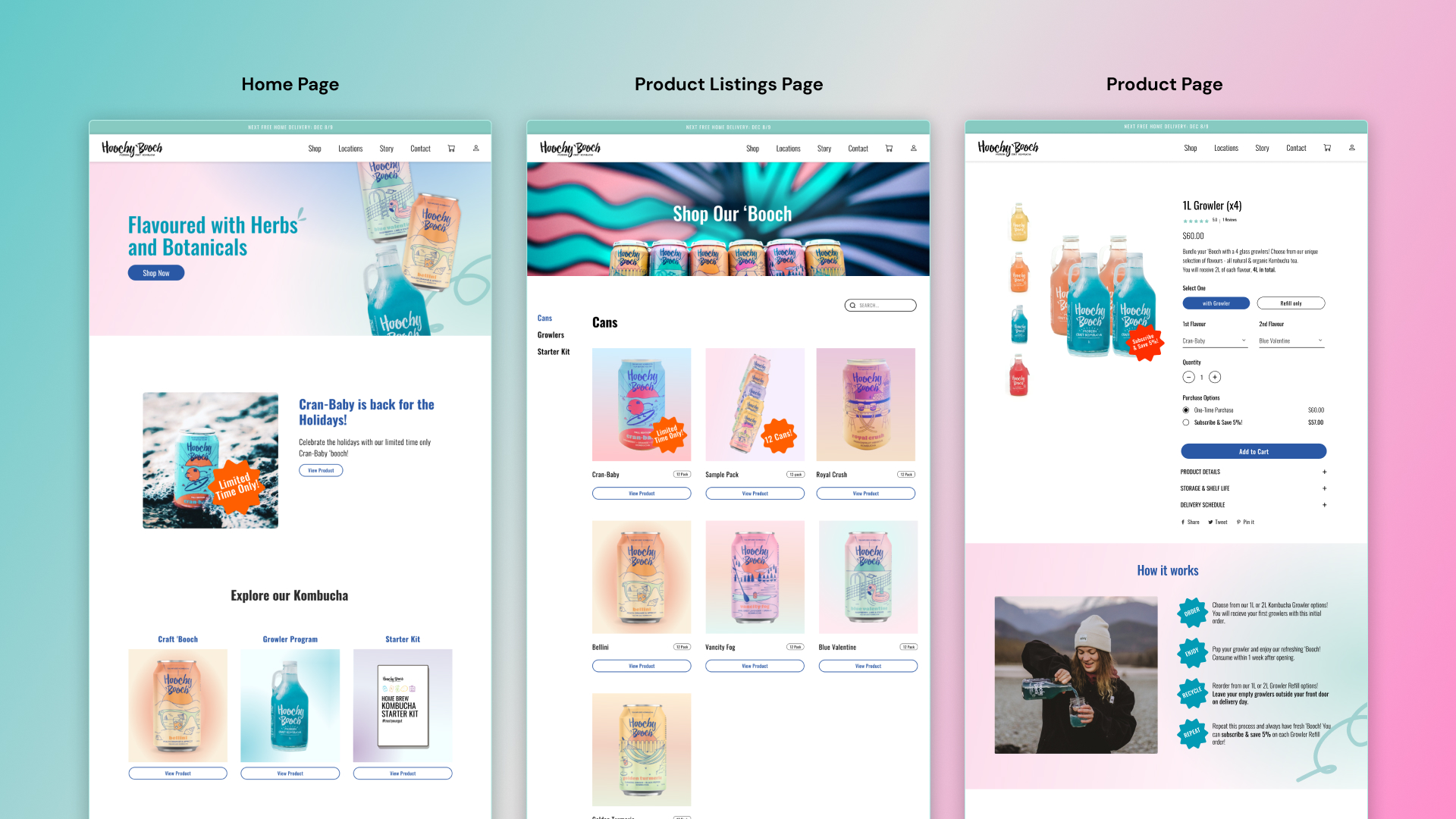
Redesigned Hoochy 'Booch pages


Redesigned Hoochy 'Booch pages

This project was the result of a final project for a senior level design evaluation course at Simon Fraser University. My team and I worked with Hoochy 'Booch to evaluate their website's ease of use, and come up with actionable changes to remedy the problems we found.
User testing, heuristic evaluations, findings report
Figma, Zoom
Anna Chi, Julia Nguyen, Gracie Gu, Priscilla Cho
September 2022 - December 2022
During initial meetings with Hoochy 'Booch where we explained the possibilities of our project scope, we were able to gather that their main goals in working with us were to increase sales and subscriptions, ultimately leading to greater brand exposure and customer loyalty.
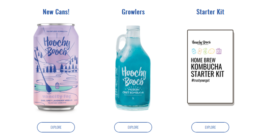
Pre-test survey results
Keeping the business objectives of the company in mind, the goal was to investigate all dimensions of usability that directly relate to the browsing and purchasing experience. Through a combination of Usability Testing, Heuristic Evaluation, and Pre- and Post-Test Questionnaires, we sought to collect data that would help answer the following research questions:
Evaluation methods employed included heuristic evaluations, pre and post-test surveys, think-aloud user testing, and user interviews. We will also conduct competitive analyses on competing kombucha company's websites to gain a better understanding of what works, and what to avoid as well.
Pre-test survey results
Heuristic Evaluation
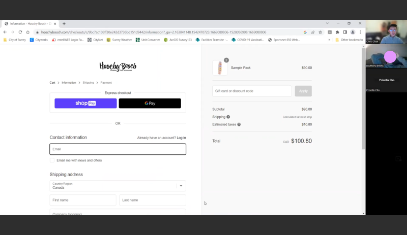
User Testing over Zoom
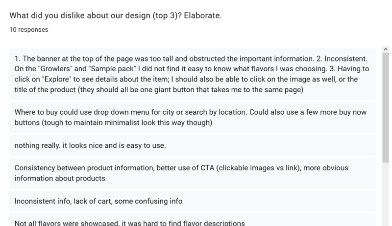
Post-test survey results
Each testing session was conducted by two team members — one would lead the session and one would take notes (See "User Testing over Zoom" above). Prior to their respective session, participants completed the consent form and Pre-Test Questionnaire. During the session, participants were asked to share their screens and were encouraged to think aloud while they performed three tasks. Each session was video-recorded with prior consent.
Participants were presented with the Hoochy 'Booch home page and given five minutes to browse the site as if it were their first time visiting. This task was not structured and was intended to inform us of how users browse, what things on the page catch their eye and their first impressions. Follow-up questions were asked, depending on the content that was explored and the comments that were made. E.g. “Based on what you’ve seen while browsing, what types of products appear to be offered?”, “What kinds of products have you tried or would you try, and why?” etc.
In tasks two and three, participants were given a short scenario and asked to think aloud while navigating the site to complete the task, making sure to give details on what they thought, how they felt, or what the expected to happen. These tasks were designed around two of the company's main goals, improving the browsing and purchasing process, and to jumpstart their kombucha subcription model.
“You’re planning a Christmas party. You have 20 guests coming over and you want to purchase some kombucha for your guests. Browse the site and finish the task by adding the product(s) to the cart and checking out.”
“You’re a die-hard 'booch fan; you love drinking kombucha daily. You’re looking for a way to keep your fridge stocked without having to go out each week. Please browse the site and finish the task by adding product(s) to the cart and checking out.”
After completing the three tasks, participants were asked a series of questions about their overall experience with the site, as well as their thoughts about any improvements or issues they would like to see addressed. A Post-Test Questionnaire was also completed after the session.
We used a couple different research techniques to ensure our data was as reliable as possible.
Involving all of our different evaluation methods, was used to study the situation through multiple lenses and broaden our insight into the underlying usability issues Hoochy 'Booch’s website faces. Insights were established based on the converging of these methods to improve validity.
Employed by using multiple researchers (the five members of our team) to analyze, interpret, and cross-check findings to mitigate the risk of observer bias.
All notes were inscribed with a high degree of detail, using direct participant quotes, and descriptions of how participants behaved. The team withheld from making interpretations of the data during the testing session, noting them down as is.
Ensured through the recruitment of appropriate target users and the usage of realistic tasks that are representative of the product's intentions.
Methods we used to analyze our collected data included affinity diagramming, analysis of descriptive statistics, and group discussions about the severity ratings from our individual heuristic evaluations of Hoochy 'Booch's website.
Navigation Snippet of Affinity Diagram
Affinity diagramming was use to analyze the majority of the qualitative data we collected, including behaviours, thoughts and opinions of our participants during user testing and answers from our post-test questionnaires. We started by transferring all main ideas onto sticky notes via FigJam and grouped them based on the type of issue being addressed. These types of issues were further grouped to show emergent themes such as "Navigation problems". Then one final grouping was done to reveal high-level themes that would inform us of key takeaways or large underlying issues that are consistent across the site.
Descriptive statistics such as frequency distribution plots were used to analyze Likert scale questions from the Post-Test Questionnaire. This helped visualize the spread of data for self-declared confidence ratings for ease-of-use, interface complexity, learnability, and good integration of functionality, which were used to supplement the findings from the Think-Aloud session and interview questions.
Group findings from the Heuristic Evaluation were analyzed through group discussion of individual findings and collective formation of severity ratings. Factors such as frequency, impact, and pervasiveness of each heuristic breach were considered when assigning severity ratings. Parallels were drawn with the key issues and themes identified from affinity diagramming and used in tandem to conclude which issues are truly relevant and problematic for our target users.
The two main themes uncovered by our analysis of the data were a lack of clarity regarding Hoochy 'Booch’s products and services, and issues with the user’s efficiency when completing tasks on the site.
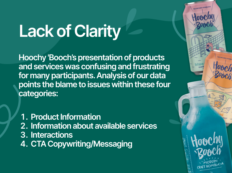
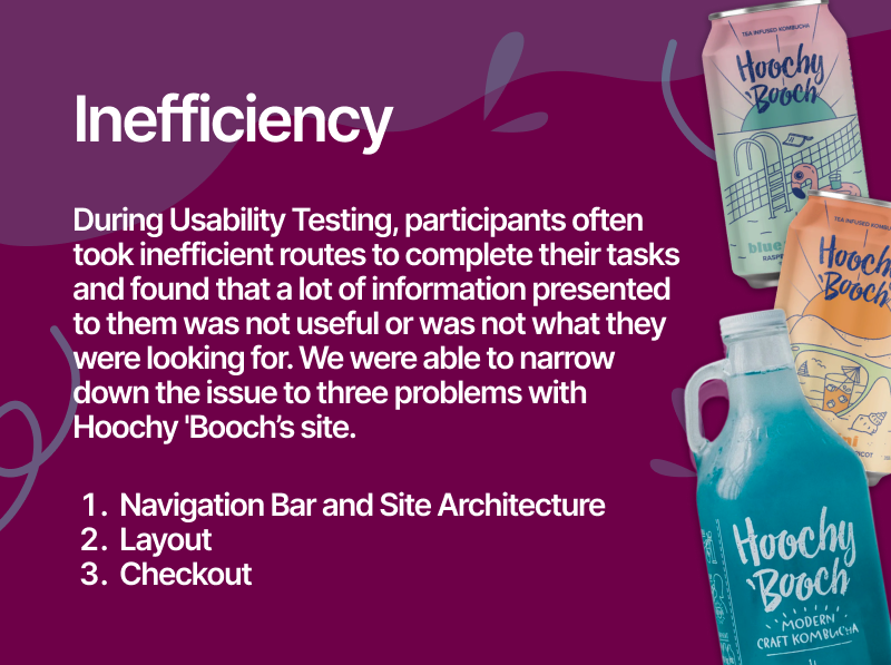
Leading ultimately to this question that framed the problem for us moving forward.
Keeping in mind our key findings and problematic themes from our data analysis, our grouped suggested 3 major changes to Hoochy 'Booch's website.
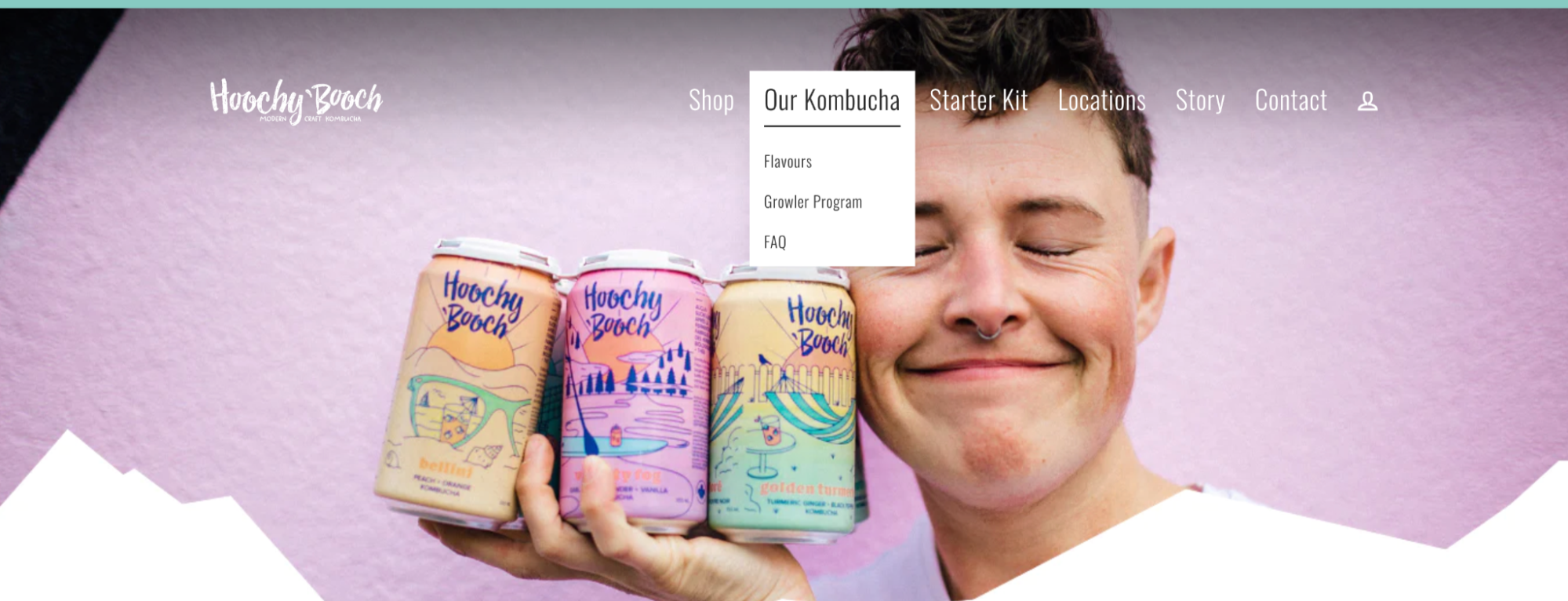
Old Navigation Bar
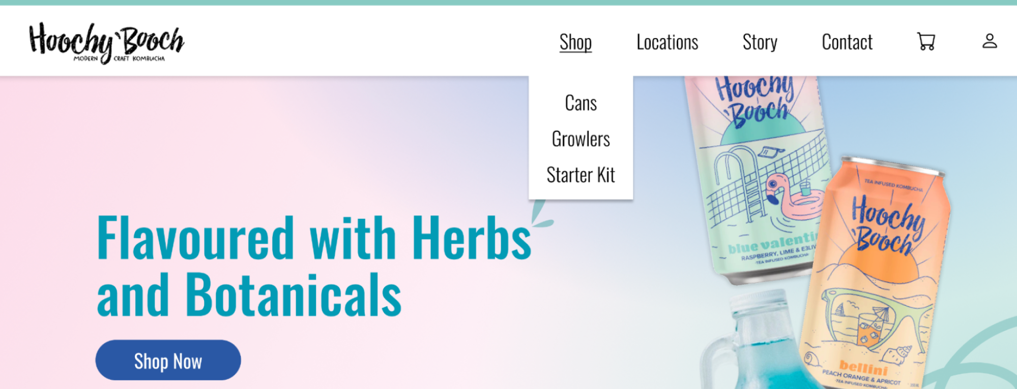
New Navigation Bar
The first priority was restructuring Hoochy ‘Booch’s website to make it more efficient for users to complete browsing and purchasing flows. The team did this by simplifying the navigation bar, through eliminating the “Starter Kit” tab and “Our Kombucha” tab, its dropdowns “Flavours”, “Growler Program,” and “FAQ”. With the redesign, users can find all the products under “Shop” for specific products. They can also click “Shop” to go to the page that shows all their products in one place. This reduces the redundancy and confusion the navigation bar had previously.
A common complaint for Usability Test participants was that there was no "Flavours" page where they could browse all the available flavours. With that on top of other issues with their current "Shop" page, we decided to completely redesign it. Major changes that were made were adding categories for the different products Hoochy 'Booch sells, adding additional information to each product listing, and clarifying CTA's to reduce user errors.
Product pages were overhauled with an emphasis on clarity of information, and providing just enough information at first glance to help the user decide if the product is for them. Some major changes included moving the description of the flavour higher on the page, adding prices to the subscriptions so that the user can visually see how much money they would save by subscribing, and hiding secondary information in accordions to save vertical space on the page.
Through Heuristic Evaluation and Usability Testing, we identified issues with Hoochy 'Booch's website, including unclear information presentation causing user frustration. Usability test participants noted inconsistent flavors and frustrating interactions. We implemented various recommendations in a redesigned prototype, focusing on key pages impacting the user experience and business goals.
After finalizing the prototype, a second round of Usability Testing with past participants yielded positive feedback. Users found the site clearer, appreciated the unified product display, and liked the improved homepage hero section with a "Shop" CTA. The redesigned product pages resolved confusion around growlers and the refill program, thanks to a new product name and an explanatory infographic.
These changes enhance usability, user understanding, and overall browsing experience, ultimately driving increased online sales and subscriptions, aligning with Hoochy 'Booch's business goals.
Looking back, I may have wanted to pay closer attention to when we decided to do heuristic evaluations. Conducting heuristic evaluations at the very beginning of our project allowed us an easy and cheap way of familiarizing ourselves with Hoochy Booch's website and brand. However it may introduced some bias into how we conducted usability testing and what problems we were able to find.
We found that they wanted us to not just find basic issues, but find non-trivial issues that could improve the site.